Just Keep Pounding
You probably thought that you couldn't go wrong with a space-themed album cover, and until today, we would have agreed with you. After all, some of the best bands in the business have used space themes as part of their album artwork. From rock bands like Iron Maiden to crooners like Elvis Presley, they've all used space to their advantage. But this CD cover is a little different - and not in a good way.
Sure, the whole thing is absolutely hilarious. But do you think the artists and the decision-makers behind this album cover knew what they were doing when they agreed on this name? They must have done, surely!
Time to Be Used
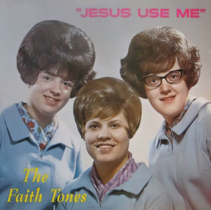
Have you ever looked at an album cover and simply shook your head out of shame for the people involved? Yes, us too. While we're sure that these lovely ladies and their faithful tones have entertained many people across the world, we can't help but think that there were some poor decisions made on that day. Of course, the first is the fact that these women could never get close to an open flame.
The second is that the name of the album is just a little uncomfortable. And the fact that it's in quotation marks just makes us question even more. Do they really want Him to use them? Or is that a decoy for something else?
An Absolute Bargain
Before we get into this bizarre album cover, let's just take a moment to appreciate how much of a bargain this musical creation is. After all, you can't get many things in the supermarket for $1.89 anymore! But when you take a closer look at the name of the artist, the name of the album, and the bizarre-looking Poodle on the cover of this album, the cheap price does make sense a little more.
We can't help but think that this must be a parody. From the name that seems like a spoonerism to the words that reek of innuendo, this is just too hilarious to be real.
The Dulcet Sounds
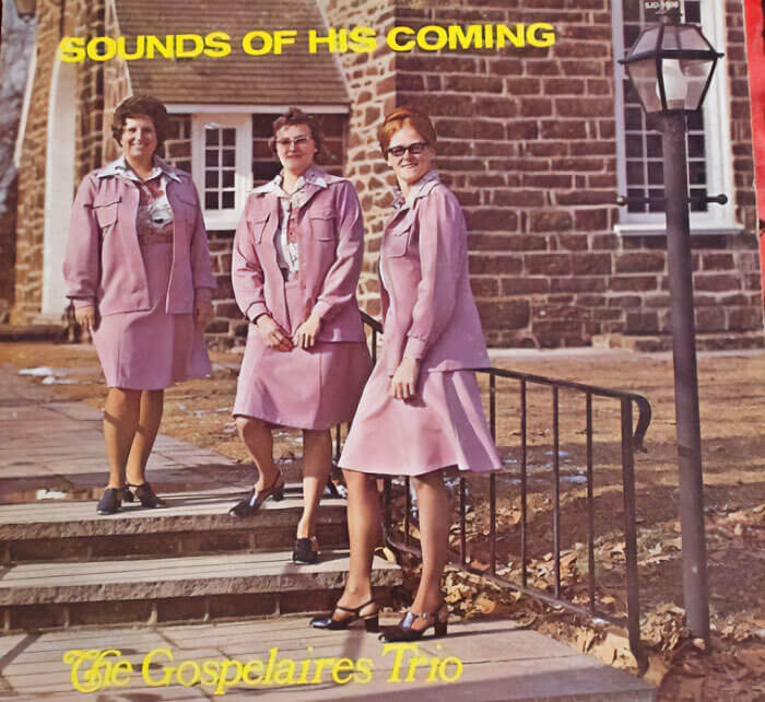
You've got to hand it to these ladies; they nailed almost all of this album cover. They decided to head out into their local area to add some nature into the mix, they found cute pink outfits that suited all of them, and they even decided to switch up their poses to make the whole aesthetic look even cooler. If they had stopped there, they probably wouldn't be on this list!
But they put their own matching feet into it when they decided to call their album, 'Sounds of his coming.' And while we know they didn't mean for this to be a massive innuendo, that's exactly what happened.
How's the Owl Lady?
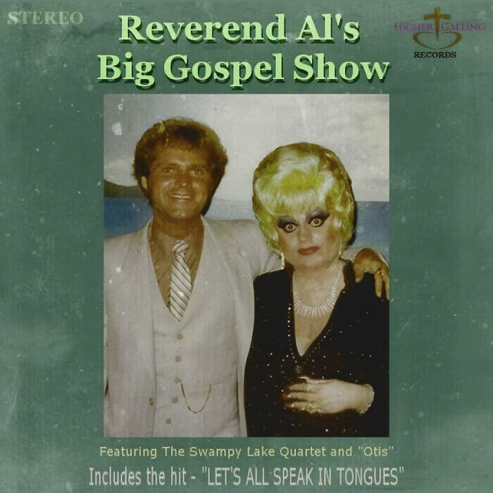
We hope Reverend Al doesn't hate us for putting his album on this list, but, really, he put this album cover on this list himself. He could have made so many different choices when deciding what to put on the front of his album cover, but he still decided to opt for a photo that didn't really do either of these two justice. Sure, he looks great. But the woman next to him? Well...
We're assuming that the woman in the picture is the one who speaks tongues. Of course, we don't know that for sure. But it's a guess that we're pretty sure is correct.
Spock and the Potatoe
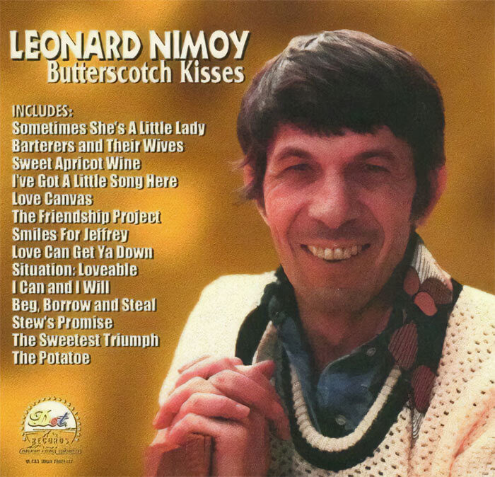
Everyone knows Leonard Nimoy, right? This actor is best-known for playing Spock in the Star Trek franchise, and there's no doubt about the fact that he'll forever be one of the most iconic people in Hollywood. However, we're going to go ahead and assume that you didn't know Spock was a singer. Back in the day, Leonard Nimoy released his very own album - and it's safe to say that we have questions.
For starters, why? And secondly, we have to question the names of the songs on this album. Especially when it comes to his spelling of popular root vegetables such as the potato.
An Icon Tries Rock
If you're not familiar with Wing, you're missing out. This Hong Kong-born New Zealand singer is iconic and has made a name for herself across the world. In fact, she's even been featured on television shows like South Park! However, she's known for her covers rather than her original songs, and she's released countless covers of songs that you wouldn't think would be in her wheelhouse. You know, like a whole rock album.
It's safe to say that we're intrigued by this album cover art. On the one hand, we love Wing. On the other hand, this doesn't look like a very rock and roll cover.
When the Party Is so Good
Have you ever partied so hard you've actually partied yourself in half? No, we haven't either - but it seems as though that was the vibe this band was going for when designing their album cover art. It looks as though this guy wasn't expecting to be pulled apart like a party cannon, either. He looks shocked, he looks confused, and he looks like he wants the music to go far, far away.
What you might not realize is that the band Party Cannon is also a death metal band, which makes this album's cover art even more bizarre. Is it bad on purpose?
What an Eyesore
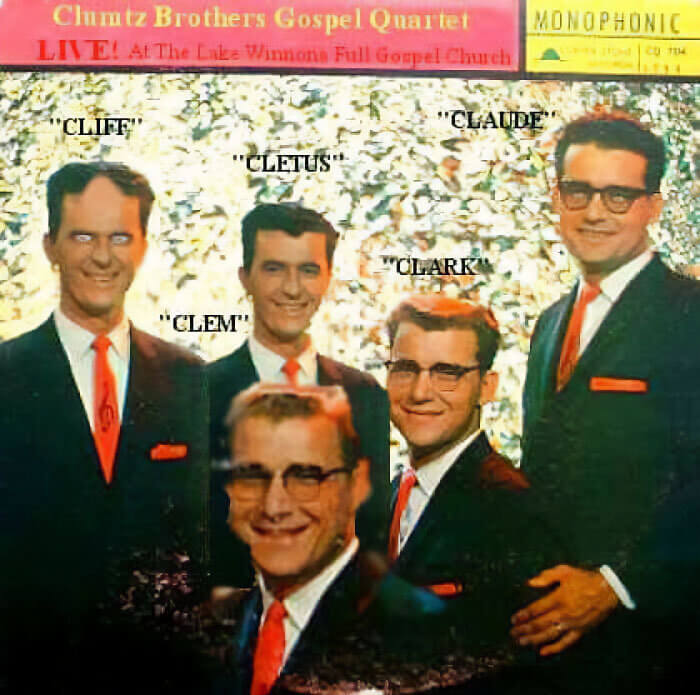
While we appreciate that some musicians aren't into the self-promotion side of things, having album artwork is key if you want to sell your music - even when you're selling gospel music. And while we'd like to give a round of applause to these guys for stepping out of their comfort zone to pose for this album, we just have so many questions about it. Most notably, why are there five people in a quartet?
To make matters even worse, it looks as though Cliff was possessed on the day of this photoshoot. If Cliff is even his real name, anyway. The quotation marks aren't helping them here.
Eat Your Veg
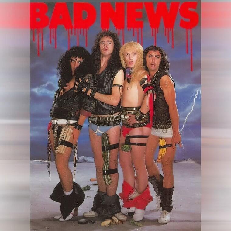
Rock bands have always brought bizarre and unusual album covers to the table. They're normally showing off their big hair, their leather jackets, and their larger-than-life personalities, and it seems as though these guys decided to follow suit. But we can only assume that they wanted to encourage people to eat more fruits and vegetables, too, which is why they decided to strap some to their legs! Why? Well, we're not entirely sure.
This whole album cover is a feast for the eyes, and although we're not sure if we like it, we still can't manage to tear our eyes away from them.
Blink if You're in Danger
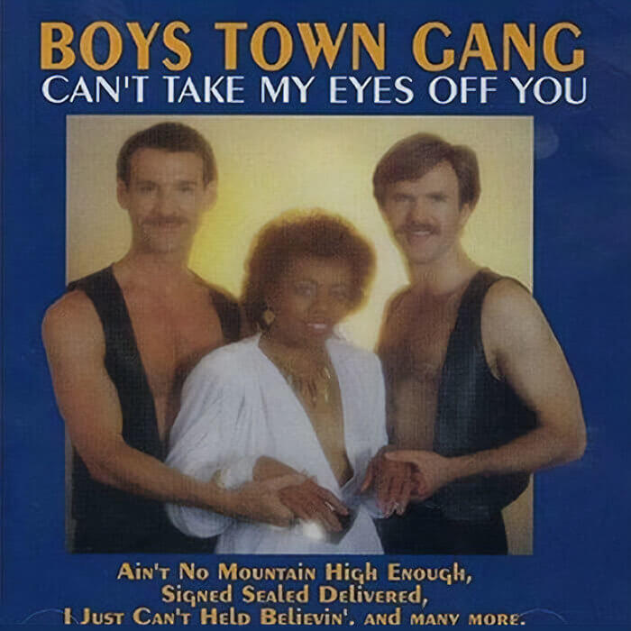
We love it when up-and-coming artists cover well-known songs that everyone loves. And from a musical point of view, the Boys Town Gang got everything right with their album choices. But from a visual point of view, we can't help but think that they should have gone with some different artwork. Sure, the guys look great, but it also looks like they are holding this woman against her will for the sake of a photo.
Let's hope that the photographer was just as uncomfortable as we were and subtly asked the woman to blink if she was in danger. She doesn't even want to hold their hands!
Poor Julie
Some of the album covers on this list are bad in a bizarre way, but this one is just bad in an uncomfortable way. And while we know that every album needs some artwork, the whole backstory behind this album cover goes a little too far. After all, most of us know the connotations of a woman's 16th birthday - especially when this song isn't about what you think at all.
This John Bult is actually a song about a father apologizing to his daughter for missing his 16th birthday. But this bad album cover design makes it seem like something much more sinister.
All About the Strategy
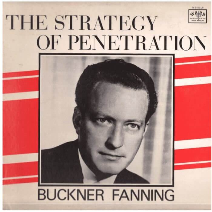
We understand that every band or musician needs to come up with a name for their album. After all, you can't release an album without a name! But we'd like to put out a petition for these musicians to spend a little more time on their names. We want them to think about every way the name can be interpreted, and then maybe that would stop them from using names like this one.
As if the name itself wasn't enough, they've then coupled the name of this album with a creepy picture of Buckner simply staring into our souls. And the whole thing is just pretty weird.
The Legend of Hercules
Some of the musicians on this list have labels with oodles of money under their belts to bring their albums to life. Others are releasing music by themselves, which means that their budget is a little smaller. So, we have to congratulate this guy for releasing his own album and designing his own artwork. That can't be easy! We do think he should have taken a Photoshop course before starting, though.
What's so hilarious about this album cover is that it looks like some kind of spoof from the 1990s, but this album was actually released in 2022. Kudos to him for going for it, though!
A Coffin Table
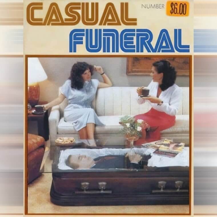
Sometimes, unusual album cover artwork goes down in history as some of the best artwork ever made. And there's no doubt about the fact that album artwork that makes you question your life choices can be pretty influential. Of course, this artwork does also divide people. Take this album, for example! While the coffin table might make some people feel a little uncomfortable, there are others who'll think that it's pretty iconic.
We have our feet firmly in the latter category, as we actually think this album artwork is pretty rad. We wouldn't want a coffin table ourselves, but the idea is cool.
Got the Moves... And the Bad Haircuts
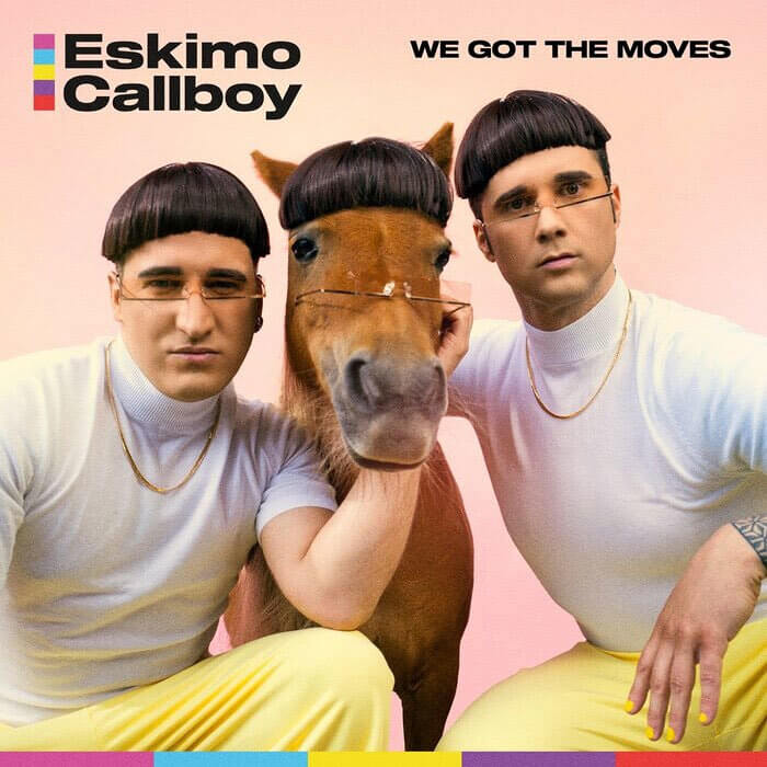
There's nothing wrong with standing out on your album cover. In fact, standing out can help you bring in even more fans and listeners! But there comes a time when you need to take a step back and question what you're trying to tell the world through your album cover. And we're just not sure what these guys are trying to say. Sure, they think they've got the moves, but they've also got the bad haircuts.
That's before we mention the strange glasses and the horse that's part of the guy gang. We're not impressed, but there's no doubt about the fact that we're definitely intrigued.
Gritty Gangster Rap
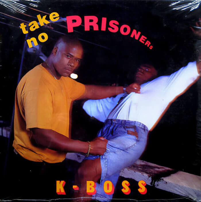
There are so many different genres of music out there. From classic rock to pop and rap, every single genre of music has its own fan base and its own group of iconic musicians. And while we have no doubts that K-Boss has a fanbase of loving gangster rap enthusiasts, we do have to question whether the WordArt and cheesy acting on this album cover screams the gangster rap he's trying to promote.
However, we do also have to appreciate the little details in this album cover artwork. To make this whole scene look more realistic, they even put fake blood on the railings! We hope it's fake, anyway.
Colors of the Wind
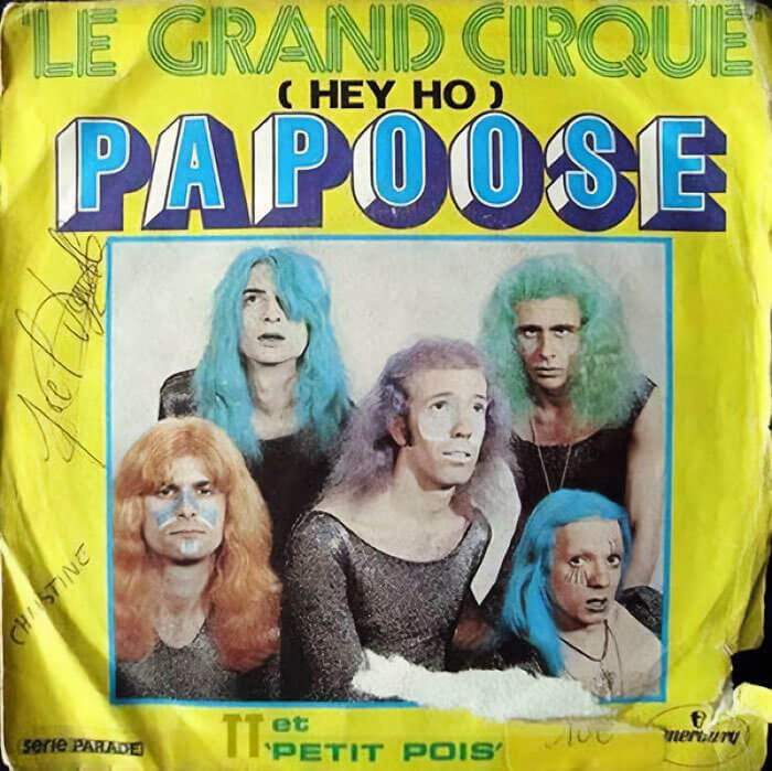
In a world full of musicians all trying to break into the music business, making your own mark as a singular artist or band is essential. You can do this through the music itself, you can do this through your image, and you can even do this through your album artwork. We can only assume that these guys decided to push the boat out and do all three - and this artwork is the result.
While we love dyed hair as much as the next person, this artwork is making our brains hurt. We can't tell if they've actually dyed their hair or they've just used some bad editing software to color their hair.
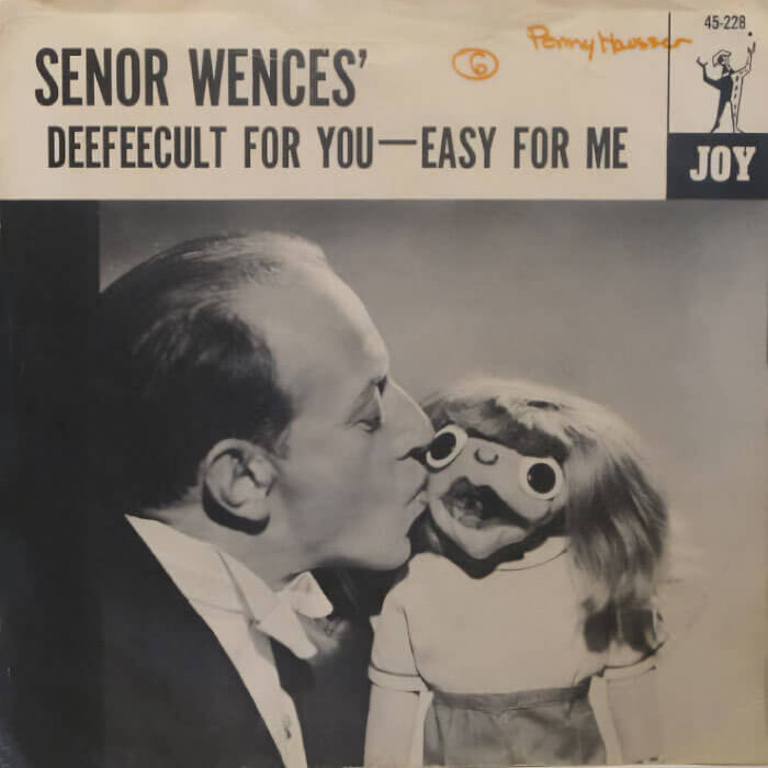
This Is Very Deefeecult
There are many musicians in this world who like to put on a show and offer something unique, and Senor Wences was one of them. In fact, this guy rose to fame through talking and singing to his own fist puppet - and he even made an album for all of his fans. He was actually very funny and talented at what he did, but there's no doubt about the fact that this album is a little strange.
After all, he's actively trying to seduce his own fist in this photo. And while his fist is camouflaged by the wig and the eyes, that's still too weird for us.
Strange Eyebrow Game
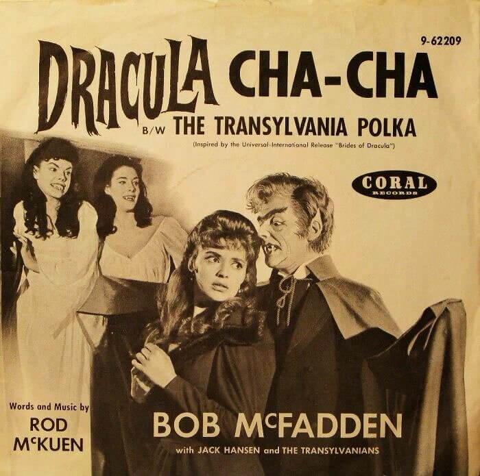
Let's just give a round of applause to Bob McFadden with Jack Hansen and The Transylvanians. In a world where polka dancing and Dracula were from two very different worlds, they decided to merge them together to make one epic album - and you have to give them credit for that! And we have to admit that we also love the album artwork for this bizarre and unusual Transylvania Polka masterpiece.
Sure, it's utterly bizarre, and the eyebrows and ears are giving us the shivers, but it's also 100% unique. And sometimes you need to give credit to the uniqueness in the world.
An Unfortunate Name
You probably don't need us to tell you that certain words have different meanings across the globe. For example, pants in the U.S. are the things you put over your underwear. But in the UK, your pants are your underwear. Because of this, it's always a good idea to double-check what you want to call your album before you go ahead and sign off on it. After all, it might mean something else in a different country.
In this instance, these guys basically insulted themselves to the entirety of the British public with their name. And while we won't tell you what this word means, we will tell you that it's not good.
Leaf It Alone
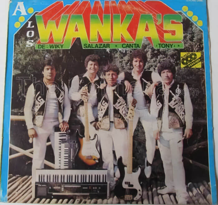
While artists with record deals have labels willing to foot the bill for their album artwork, the same can't be said for independent artists. They have to foot the bill from their own savings, and this can be hard when you have a very specific idea. And while this band wanted to use leaves to showcase their musical creativity, they had to rely on very obvious red tape to stick the leaves on.
We're going to go ahead and assume that this album artwork was the idea of the guy in the middle. The guys on either side of him look like they want to go home.
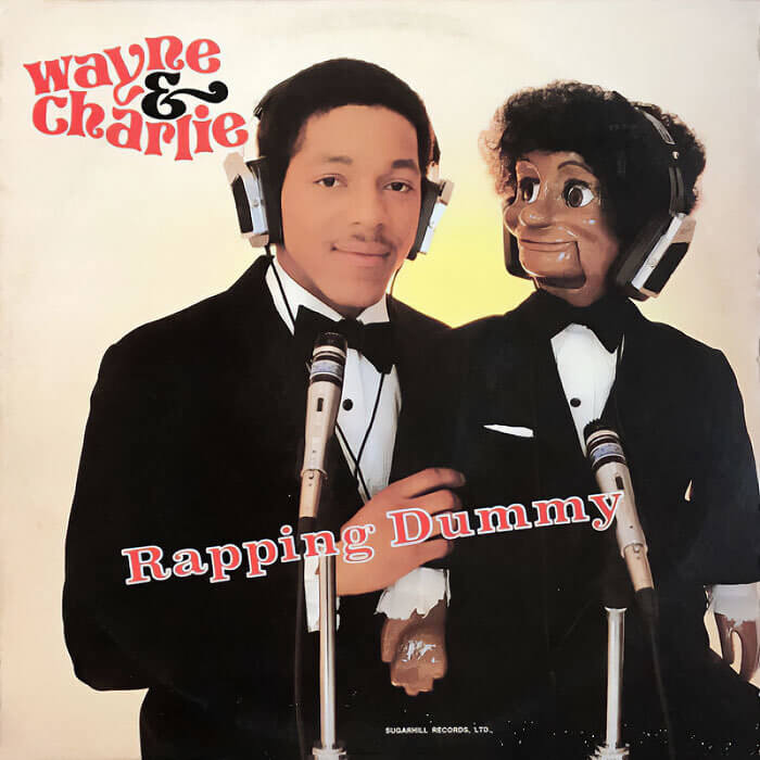
The Rapping Dummy
The world is full of different music. From mainstream music in the charts to independent and niche music with a very specific fan base, one thing these musicians all have in common is that they need to design and release their very own albums. But what do you do when you're a guy with a rapping dummy? Well, you dress yourselves up in a tuxedo and smile for the camera, of course.
What's funny about this album artwork is that, actually, the dummy looks more lifelike than the man himself. And this just goes to show that the airbrush tool can be used too much.
Beware the Pizza Cat
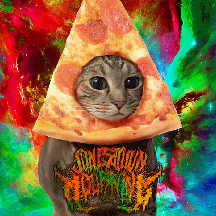
Some musicians use their album artwork to put across deep and impactful stories and messages. But sometimes you come across bands or musicians who just do what they want with their album artwork - and it's pretty refreshing. Take this band, for example. They love pizza and cats, so they've used pizza and cats for almost every album cover artwork they've ever released. In fact, we see nothing wrong with that.
We also love pizza and cats, which is why this album cover is one of our favorites on this list. We bet some people would buy this album for the artwork alone.
Before Dog Was a Bounty Hunter
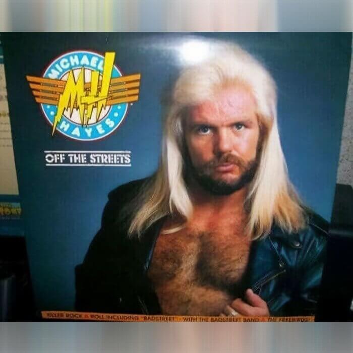
If you're a fan of the WWF, you'll probably be familiar with this guy. But if you're not a fan of the WWF, you're probably thinking 'WTF' to yourself. This guy looks like Dog before he was a Bounty Hunter, but it's actually Michael Hayes. This former wrestler tried hard to make his mark on the music world, and this artwork goes to show that he took the whole thing very seriously.
But aside from Dwayne 'The Rock' Johnson, no other wrestler has really found fame as a singer - which is probably why you've never really heard of this guy before.
An Itchy Scalp Commercial?
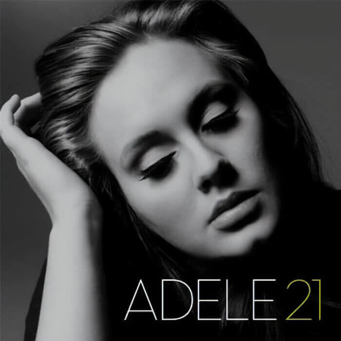
You probably don't need us to tell you that Adele is one of the most famous singers in the world. Her songs will go down in history, and she probably doesn't even need to bother with album cover artwork. Her fans will buy anything she puts out - but that doesn't stop her from going hard with the cover art. Her '21' album did leave people a little confused, though.
From the looks of it, this is more of an itchy scalp commercial than an album cover. But who are we to judge? If Adele has an itchy scalp, that's her issue to deal with.
Oh, We're Trying Not to
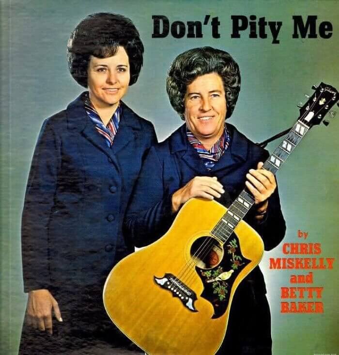
Have you ever had an instance where someone has told you not to do something, so that's exactly what you've done? Humans are stubborn, but it seems as though Chris Miskelly and Betty Baker forgot about that little nugget of information. They should have realized that if they were going to tell the general public not to pity them, that's exactly what they were going to do! Especially with those matching hairstyles.
While we're sure their music isn't worth pitying and that their album is full of feminist anthems, we do think they should have reconsidered the name of their album on this occasion.
Are You Bad?
Let's be honest; there are probably tons of fans of The Cramps out there. And there are probably tons of The Cramps fans who are going to be outraged that this album cover is on this list. But the people have spoken, and it seems as though this is considered to be one of the worst album covers of all time. Maybe it's because the world is full of good people who can't resonate with the bad people of the world.
We don't know whether it's the bright yellow color or the bright whiteness of this guy's teeth, but there definitely is something about this artwork that makes us feel a little strange.
Parental Advisory
While we're sure that the 'Parental Advisory' warning on this Tyler the Creator album has more to do with the language used within the songs, we can't help but think that the parental advisory warning was tailored more towards the awkward '90s photos he used for it. Sure, we know Tyler is a little kooky and quirky, but this is bringing back bad memories of our old prom photos from high school.
We have a feeling that Tyler is parodying these photos more than anything, but there's no doubt that most people wouldn't want this album sitting on their shelf in their bedroom.
That Gene Simmons Makeup, Though
It's important for musicians to stand out from the crowd and to show their individuality as artists. But there's no doubt about the fact that these musicians all have inspirations - and we're going to go out on a limb here and say that these guys have two inspirations: Gene Simmons and Nicolas Cage. They look like they have merged their two loves to form one band, and the makeup is on point.
Of course, Knorkeater looks absolutely terrifying, and we have no idea what this album is called. But if they're a Gene Simmons tribute act, then they've absolutely nailed their jobs.
The Heaviest Accordion in the World
When we first set eyes on this album cover, we were a little concerned for Nacha's health and safety. After all, this looks like a very heavy accordion, and she seems to be struggling with it immensely! But we guess that's the reason why she decided to call her album the 'Heavy Tango.' Perhaps she was planning on dancing with the accordion, but just found it way too heavy for her.
Whatever the case, we hope that she got the help that she deserved. And we really hope that this album proved to be very successful for the singer, even though we're not familiar with her.
A Real Album Cover
We've seen some pretty interesting album covers on this list, but have you ever seen one as cracking as this? While we can't translate what this album cover says, we don't think the photographs used on this album cover need too much interpretation. After all, it's pretty obvious to see a guy with a guitar and his female friend who refuses to wear clothes. Why? Well, we're not exactly sure why.
The last time we checked, trying to play the guitar while a naked woman is hugging you isn't the easiest thing to do. So we guess kudos to this guy should be given.
The Most Wanted Man
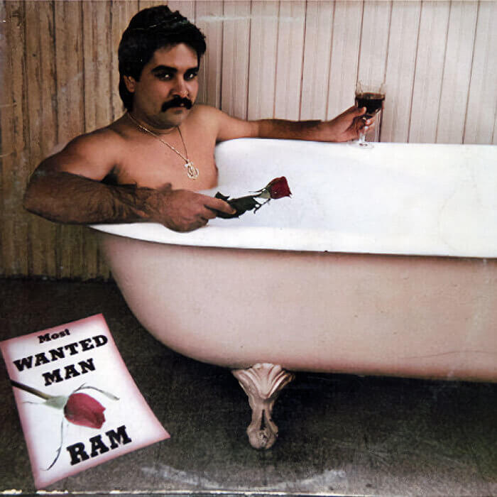
We love a bath as much as the next guy, but most of us don't choose to photograph ourselves in the bathtub to promote our music. But maybe we should? This guy seems pretty confident with his decision, so much so that he's decided to call himself the Most Wanted Man. We're not sure what he's wanted for, but we can only assume that he's wanted for crimes against music.
Of course, what do we know? This guy could be the best musician the world has ever seen. It's just a shame that most people won't be able to get past this bathtub album art.
A Perfect Massage Soundtrack
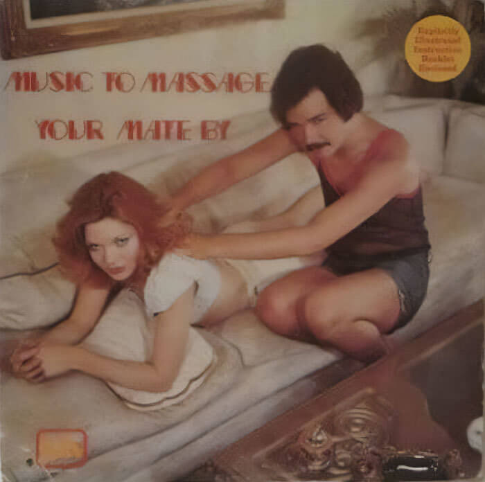
Have you ever been in a situation where you've been massaging your mate and thought that the music in the background just didn't seem to match the vibe? Not to worry, because this album exists! And if the name of the album wasn't enough, the album cover art is utterly terrifying. But we don't blame these two for such a thing. We blame the label for letting these musicians use such a photo for their cover.
Even if this was a collection of love songs, the creepy photo just makes us feel a little uncomfortable. And we have to question the word 'massage.' Those eyes don't seem to suggest that a massage is going down.
This Hasn't Aged Well
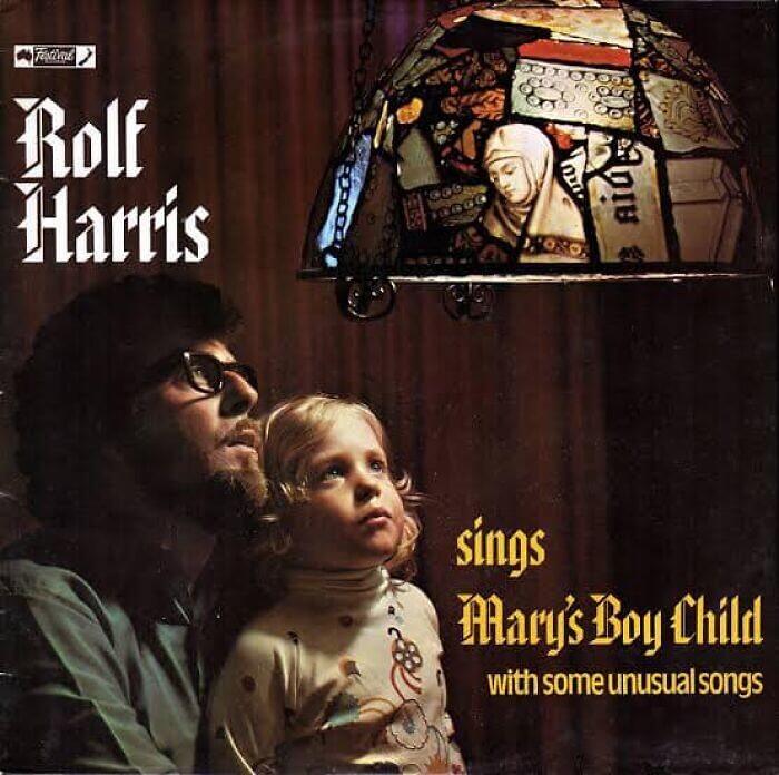
Before we get to the fact that this is a Rolf Harris album cover, we should probably get to the fact that the name of this album is pretty strange. While we don't expect every musician to outline all of their songs on the album cover (here's looking at you, Leonard Nimoy), this cover is a little vague. After all, we're not sure what's meant by the words 'unusual songs.'
And if you're not sure who Rolf Harris is, one quick Google will tell you that this album cover art is wrong on so many levels and probably shouldn't exist in the slightest.
Shades of Joy? Or Shades of Terror?
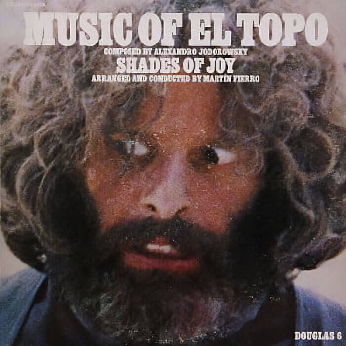
It's not uncommon for popular movies to have their own albums. Within these albums, you'll find the songs heard throughout the movie, and this is the case for this particular album. With music taken from the El Topo movie, it's a popular purchase for those who have seen the film. But anyone who has seen this movie will know that it's pretty bizarre - which is probably why this album cover is also pretty strange.
From the crazed look in this guy's eyes to what looks like white powder across his face and in his hair, we have so many questions about this album cover. But we have so many questions about all of the album covers on this list, to be honest.
Who Dunnit?
We love a murder mystery as much as the next guy. In fact, the whole world loves reading and watching murder mysteries. It's not often you come across a whole album dedicated to a murder mystery, though. But it seems as though that's exactly what Ta Smallz did when he was thinking up ideas for his next album. He decided to dedicate the whole thing to finding out who killed his mama.
While we still don't know who did it, it would be pretty ironic if one of the other rappers featured on this album was the one who did it. That would be a huge twist.
An Outfit of Dreams
If you were a musician and needed to take photos for an album cover, what would you wear? While famous artists can utilise designer clothes and celebrity stylists to pick out their outfits and ultimately make them look the best they can be, the same can't be said for independent artists who aren't quite as mainstream. That's probably why this person ended up looking like this on their album cover.
While we admire the confidence to dress this way on an album cover, the whole thing is just a little bizarre. But that might have something to do with their scary eyes.
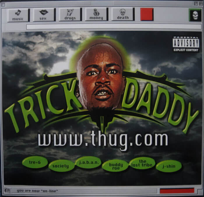
Thug Dot Com
Your album art can make or break your album as a whole. And while those who have listened to Trick Daddy's 'Thug' album will know that it's actually pretty good, the main thing people remember about this album isn't the music itself. Instead, they remember the album art! It looks like something that has been screenshot from an old computer, and we'd love to know whether he actually owns that domain or not.
But what we love most about this album cover is that it's so bad that it's actually brilliant. If people are talking about you - even if it's just because of your bad album art - you're doing something right.
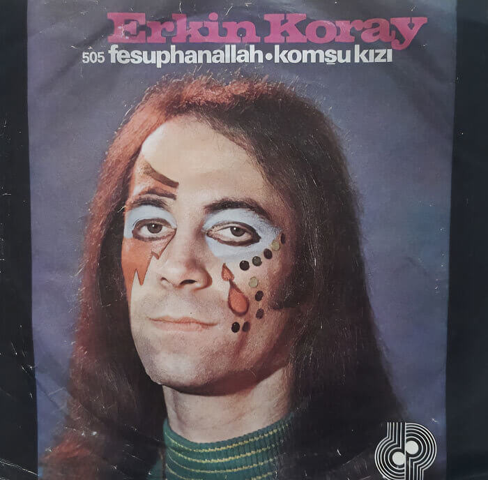
Serving Serious Face
Over the years, many musicians have made their mark through their makeup. Yes, Bowie and his lightning bolt and KISS and their white faces have gone down in history as some of the greatest looks of all time. So, we don't blame up-and-comers for trying to replicate this same success. Take this guy, for example. He obviously wanted to incorporate Bowie, KISS, and some prison tattoos into his album artwork.
Of course, you've probably seen better makeup before, and we can only assume that he has, too. That's probably why he doesn't look very happy with the finished product on the cover.


